PRODUCTION


Category
designAbout This Project
ABOUT
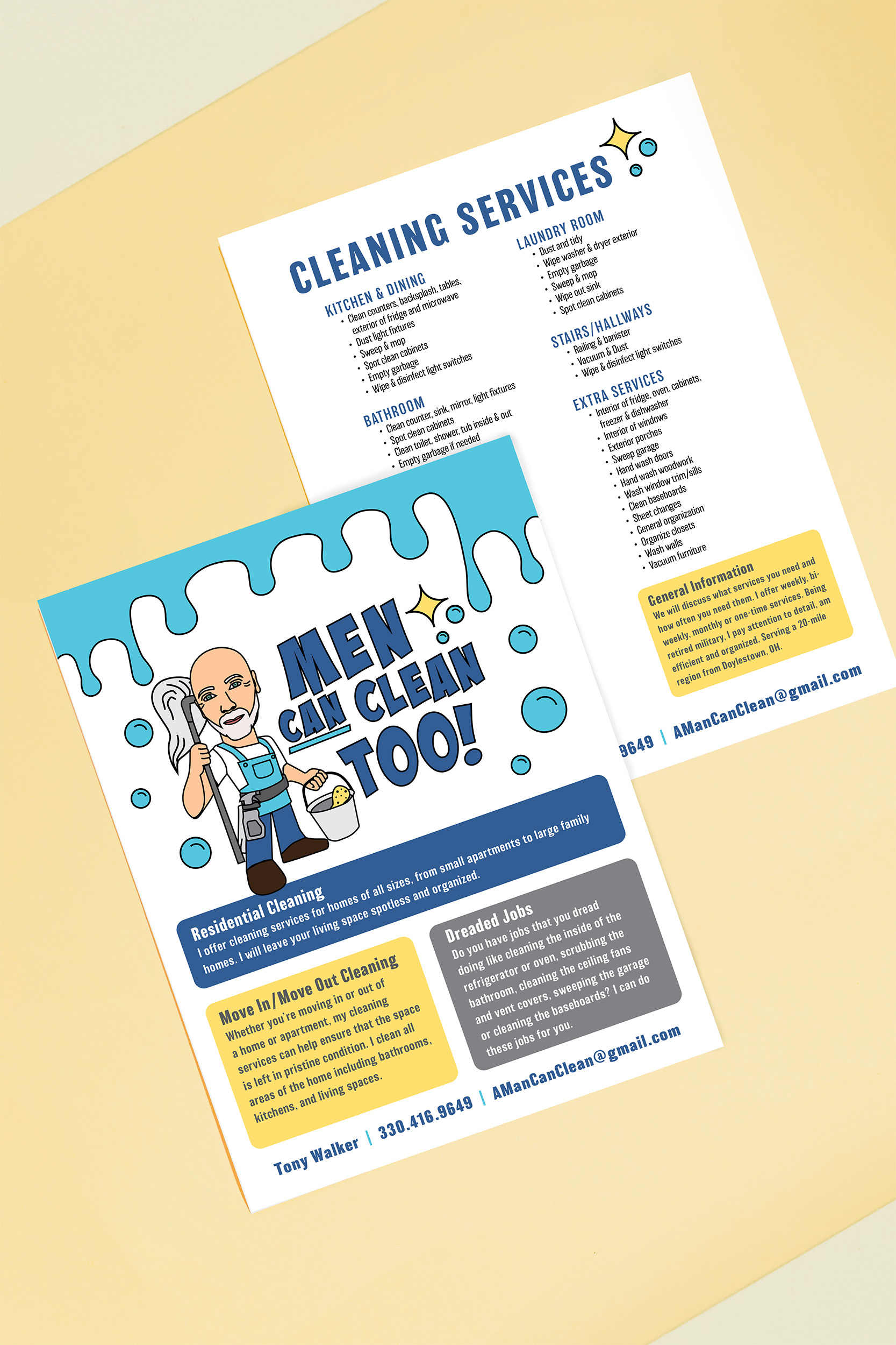
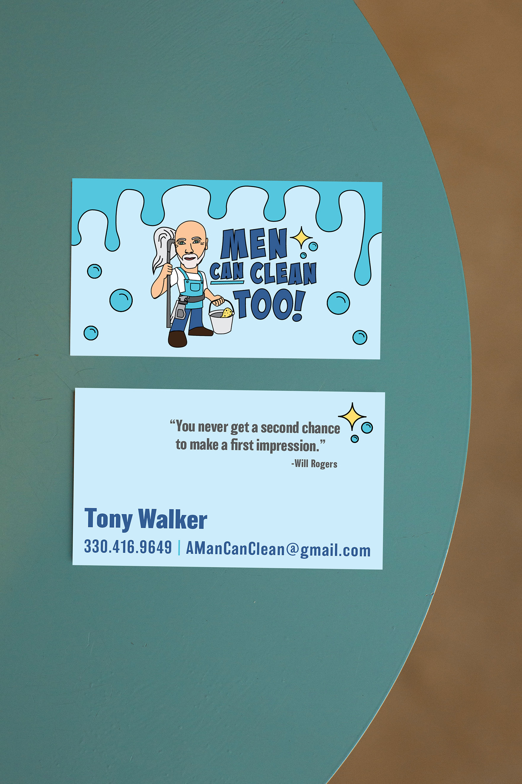
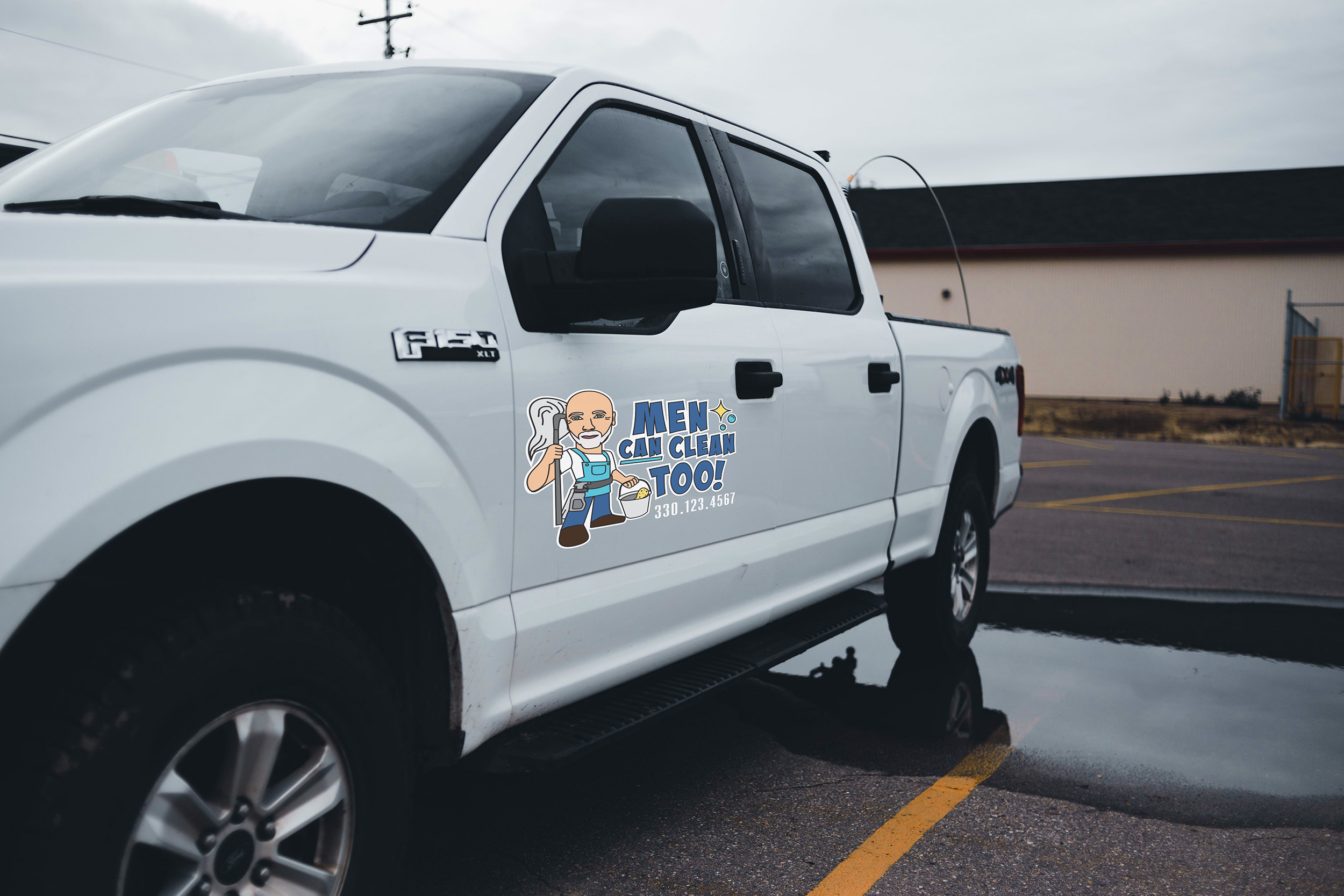
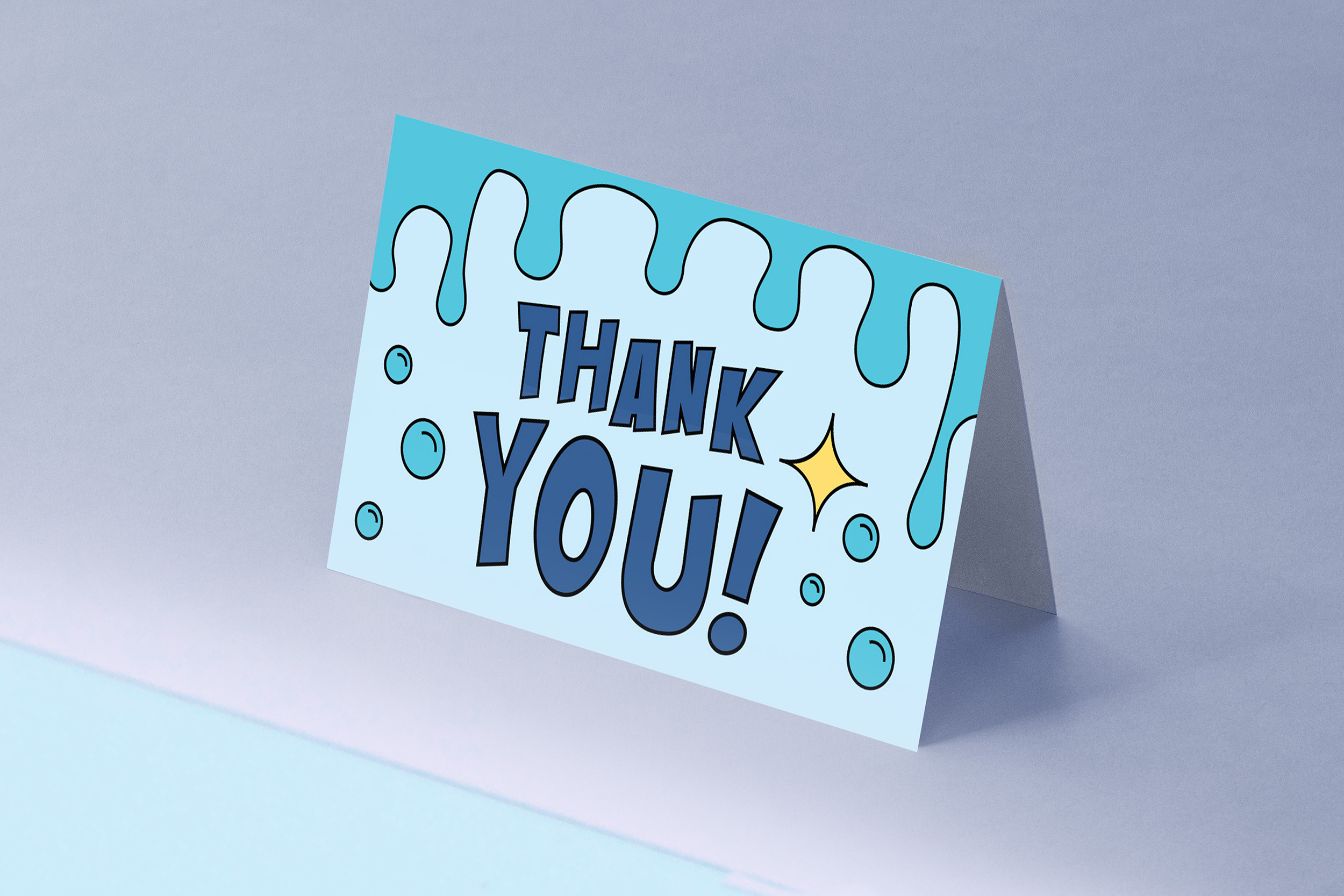
Branding for a local retired military man who wanted to start a cleaning business. Designed the logo, flyer, business cards, truck decal and a thank you card.
Client wanted a clean characterized version of himself, similar look to the Mr. Clean® branding, given his similar resemblance. Client wanted a playful logo with a lighthearted tone, so the bold, irregular comic-style lettering reinforces that sense of humor in the business name. The illustrated character creates a friendly visual representation of the client while adding personality to the brand. The cool blue color palette communicates cleanliness and freshness, while the bright yellow accents add energy. Together, the expressive typography, character illustration, and playful cleaning imagery create a logo that feels confident, humorous, and approachable, helping a traditionally serious military identity transition naturally into a fun and distinctive cleaning brand.